Category: Web Design

How To Choose The Right UI/UX Design Agency In 2024?

How To Choose The Right UI/UX Design Agency In 2024?

Do you know about Amazon, Netflix, and Uber? Of course, these are some names of giants in their industries. But, have you ever thought about what’s the common thing that they have used in their business to stand out from their competitors? They have amazing marketing modules as well as unique website designs in their online platform that differentiate their brand from others. 

Developing a unique design requires lots of creativity and skilled web designers. Many researchers have studied the impact of bad and unprofessional website design. And the result can surprise you, a bad design can ruin your brand and destroy the trust of customers. 

So, you need to focus on developing a good website design for your website. Thus, to enhance your website design, you need to hire experienced and skilled web designers. In this blog, we will explain to you the top 10 key factors for selecting the right UI/UX design agency. So, stick to the end.

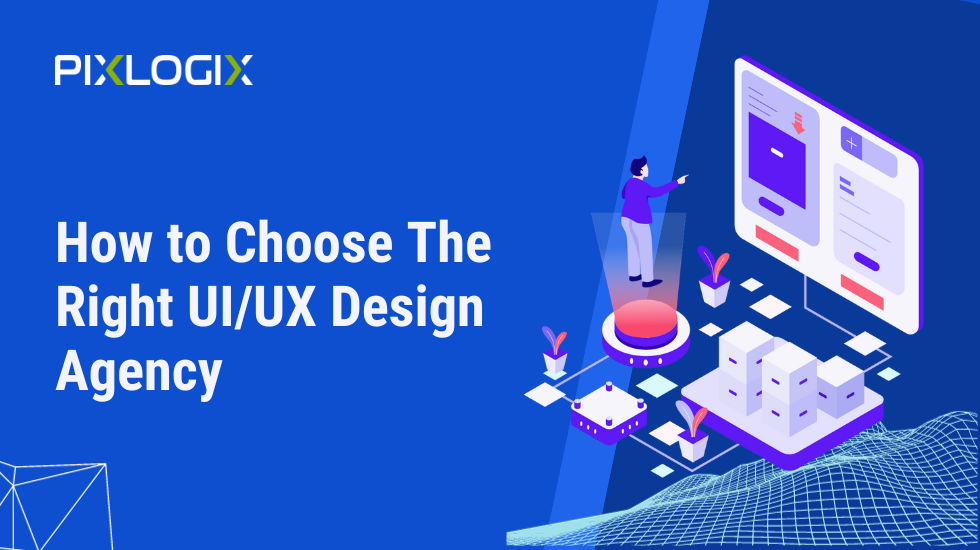
How to Select the Ideal UX/UI Design Agency?

There is a huge demand for UX/UI design services, and to fulfill that demand a number of companies are available. But all those are not fit for every business. So, when you hire a relevant company, you will feel frustrated in the end. Thus, to save your resources, you can follow these steps for identifying the highly skilled UX/UI design agency in 2024.  

#1: Gather Your Product Design Requirements

Before you start searching for a web design agency, you need to clearly define your product or brand design requirements. Knowing what you need will help you start finding an agency that specializes in the specific design services you require.

For example, a Voice-controlled User Interface is an advanced feature that enhances your special customers who can not see. So, if you want to add these features, you need to explore the companies who have completed a similar project for their previous clients.  

#2: Examine the Portfolio of the agency

After getting a clear idea about requirements, you need to look at the agency’s portfolio to see their experience and expertise. Every experienced UX/UI designer wants to display their portfolio to showcase their expertise. You can find the UX/UI design portfolio on their website. 

During research for skilled UX/UI designers, this portfolio helps you identify the finesse company, which commonly works on projects similar to yours. By reviewing the portfolio, you gain insights regarding their design style and capabilities.

#3: Check out for their client’s experience

There are many third-party websites like Clutch, Goodfirms, Google Maps, etc., offering review sections for all businesses. In this review section, people can share their experience stories with other people.

You can visit these profiles of the company and reach out to the agency’s previous clients, or read reviews and testimonials to understand the experiences of others who have worked with them. This can provide valuable information about their professionalism and work quality. What challenges have they faced with the company, how do they handle the project and all that important stuff? 

#4: Team size

You also need to consider the size of a company to understand its work quality. To understand this, let’s see a scenario. 

Suppose, you want to implement AR experience design and cross-platform UI/UX design. Now these two are very different to master and with a small team, you may not get high-quality solutions for all your requirements. So, to utilize the resources better you need to keep their team size in mind which offers you more resources and expertise. 

Apart from this, a very big company can also not be relevant for your business if you are looking for a minor or some update because they didn’t give you proper attention. Thus, hire the most suitable company that matches your requirements and gives you proper attention. 

#5: Know their work environment

Understanding the work environment of a UX/UI design agency provides insights into their commitment to quality design. A modern, creative, and collaborative workspace typically indicates an agency’s adaptability to industry trends and innovative design practices.

A positive work environment fosters creativity, enhancing the likelihood of delivering exceptional design solutions. By considering the agency’s work environment, you can assess its ability to stay at the forefront of design excellence and its potential to provide cutting-edge solutions for your project.

#6: Assess their communication skills and professional attitude

Initial interactions with the agency offer critical insights into their ability to understand your needs, convey ideas, and respond promptly. A clear, responsive, and professional communication style indicates a commitment to a smooth collaboration, reducing the likelihood of misunderstandings and project delays.

A design agency with strong communication skills is more likely to grasp your vision, provide regular updates, and address concerns promptly, enhancing the overall project experience and ensuring that your design project aligns with your objectives.

#7: Understanding of the design tasks

An agency’s success hinges on its grasp of your goals, target audience, and the precise design tasks needed. A design agency that thoroughly comprehends your vision is better equipped to craft solutions that resonate with your objectives and target audience.

This understanding is pivotal for creating designs that are not just visually appealing but also functional and purpose-driven, leading to a more successful and aligned design project. It ensures that the agency can effectively translate your ideas into tangible, impactful designs that meet your specific needs.

#8: Project Management Approach

The project management approach adopted by a design agency plays a crucial role in project success. By asking about their methods for planning, tracking, and delivering projects, you gain insights into their organization and commitment to quality. A well-organized agency is more likely to adhere to project timelines, ensuring timely delivery. 

Effective project management also involves efficient resource allocation and problem-solving, which contributes to high-quality work. Therefore, understanding their project management approach helps you assess their ability to execute your project efficiently, meet deadlines, and produce top-notch design solutions that align with your objectives.

#9: Design tools and approach they follow

Inquiring about their tools and practices helps assess their commitment to staying current in the ever-evolving design landscape. Proficiency with the latest design software and adherence to industry standards are indicative of their ability to produce high-quality work.

Modern tools enable innovative design solutions, and established methodologies ensure a structured and effective design process. Therefore, an agency that uses contemporary tools and follows industry best practices is more likely to deliver designs that are not only visually appealing but also functional, ensuring your project’s success.

#10: Check for their Development support 

When considering a UX/UI design agency, check for development support, especially if your project involves both design and development phases. It’s essential to confirm whether the agency offers in-house development services or has established relationships with reliable developers. This ensures a smooth transition from design to development, streamlining the entire process. 

Collaboration between designers and developers within the same agency or network fosters seamless communication, reduces the risk of misinterpretation, and speeds up project delivery. Such integrated support ultimately leads to a more efficient and successful project, with both design and development aspects harmoniously working together.

Mistakes to avoid when selecting the right UX/UX Design Partner

In the world of UX/UI design, a cost-driven approach and negligence regarding confidentiality rights can spell disaster for your project. Prioritize quality over cost. High-quality design work often comes at a higher price, and prioritizing cost over quality can lead to disappointing results. Invest in a design agency that can deliver value and quality. 

Additionally, ensure that the agency respects confidentiality and intellectual property rights. Sign a clear contract that outlines these aspects to protect your project’s sensitive information and assets. By meticulously considering these factors, you can confidently choose the right UX/UI design partner and pave the way for a successful 2024.

However, if you are looking for top-tier UX/UI design services to drive your business’s success in 2024? Trust Pixlogix Infotech Pvt. Ltd., your partner for cutting-edge design solutions. Contact us today for exceptional UX/UI design services that prioritize quality, professionalism, and confidentiality. To elevate your digital presence, visit their site now. 

Best Beginner Guidance To Responsive Web Design

Best Beginner Guidance To Responsive Web Design

Do you know responsive web design is essential for growing your business online? Almost every website wants a responsive website that works on every device, like desktops, mobiles, and tablets. 

According to Statista, “Upcoming eras will shift on mobile devices. Thus, you lose many visitors if your website does not fit on every device and browser.

However, creating a website version for each resolution and new device would be impossible for every business. To resolve these issues, you can take help from responsive web developers or web development companies. But before that, let’s understand in-depth responsive Web design and its importance, as well as how you can make a responsive web design by yourself. So, stick to the end. 

Responsive Web Design: What It Is?

In web design and development, Responsive web design relates to an approach for developing the interaction website across a wide range of devices and screen sizes. The main goal of responsive design is to ensure that a website can adapt and respond to different devices, such as desktop computers, laptops, tablets, and smartphones, without the need for separate versions or dedicated mobile applications.

Responsive web design uses a combination of flexible grids, fluid layouts, and media queries to adjust the layout and content of a website based on the characteristics of the device being used. This means that regardless of whether a user is accessing the website on a large desktop screen or a small smartphone screen, the website will automatically adjust its layout, images, and text size to fit the screen appropriately.

By implementing responsive design techniques, websites can provide an optimal user experience by ensuring that content remains readable, images are appropriately sized, and navigation is accessible across various devices. This approach eliminates the need for users to constantly zoom or scroll horizontally to view the content, making the website more user-friendly and accommodating to different devices.

Responsive web design has become increasingly important with the rise of mobile devices and the diversity of screen sizes and resolutions. It allows businesses and organizations to reach a wider audience and ensures that their websites remain accessible and visually appealing on all devices, enhancing user engagement and satisfaction.

Responsive Web Design: Why Is It Important?

After understanding the meaning of responsive web design, you better get some idea about how important it is to have a responsive web design for your website. Here we list some major importance of responsive website design for business websites like yours:

#1: Improved User Experience

With the increasing use of mobile devices to access the internet, responsive design ensures that users have a consistent and optimized experience across different screen sizes. The website adapts to the device’s screen, making navigating, reading content, and interacting with the site easier, which leads to higher user satisfaction and engagement.

#2: Increased Reach

Responsive design allows your website to reach a broader audience. Since it adjusts to different devices, users can access your site from desktops, laptops, tablets, and smartphones without any issues. This inclusivity helps you reach more potential customers and ensures that your content is accessible to everyone, regardless of their device.

#3: Cost and Time Efficiency

In the past, businesses often created separate versions of their websites for desktop and mobile devices. This required extra development time, resources, and maintenance. With responsive design, you only need to build and maintain one website that adapts to different devices, reducing development and maintenance costs in the long run.

#4: SEO Benefits

Search engines like Google prioritize responsive websites in their search results. A mobile-friendly site is crucial in search engine optimization (SEO). Responsive design helps improve your website’s SEO performance, leading to better visibility, higher rankings, and increased organic traffic.

#5: Future-Proofing

Responsive design is adaptable and flexible, making your website ready for future devices with different screen sizes and resolutions. As new devices are released, your website will automatically adjust and provide an optimal user experience without requiring significant redesign or redevelopment.

#6: Social Media and Sharing

Responsive design enhances the sharing and social media experience. When users share your website’s content on social media platforms, the responsive design ensures that the shared content looks good and functions properly on different devices. This can lead to increased social engagement and exposure for your brand.

Overall, responsive web design is crucial in today’s digital landscape. It ensures that your website is accessible, user-friendly, and visually appealing across various devices, providing a positive user experience and helping you reach a wider audience. Now, let’s read about the steps or elements that help you in developing a responsive website for your business. 

How To Make Responsive Web Design for Businesses?

Creating a responsive web design requires careful planning, thoughtful design decisions, and implementation techniques that adapt the website’s layout, content, and functionality to different devices and screen sizes. Here are the key steps and best practices for making a responsive web design.

Understand Responsive Design Principles

Before diving into the implementation process, it’s essential to grasp the core principles of responsive design:

  • Fluid Grids: Use relative units like percentages rather than fixed pixel values for layout elements. This allows them to adjust proportionally based on the screen size.
  • Flexible Images and Media: Set images and media to scale dynamically, preventing them from overflowing or appearing too small on smaller screens.
  • Media Queries: Apply CSS media queries to apply specific styles based on the device’s screen size, orientation, or other characteristics.

Plan and Structure the Layout

Start by planning and structuring your website’s layout in a way that accommodates different screen sizes. Consider the following:

  • Content Hierarchy: Determine the most important content elements and ensure they are prominently displayed on all devices. Prioritize content based on its relevance and importance to the user.
  • Breakpoints: Identify the key screen widths your design needs to adapt to. Common breakpoints include those for smartphones, tablets, laptops, and desktops. Consider the unique needs and characteristics of each device type.
  • Mobile-First Approach: Begin designing for mobile devices first and then progressively enhance the larger screens’ layout. This ensures a solid foundation for smaller devices and avoids over-complication.

Use CSS Media Queries

Media queries are CSS rules that apply different styles based on the characteristics of the device being used. Use media queries to adjust the layout, typography, images, and other design elements at specific breakpoints. For example:

CSS

Copy code

/* Styles for devices with a maximum width of 600 pixels */

@media (max-width: 600px) {

  /* CSS rules for small screens */

}

/* Styles for devices with a width between 601 and 1024 pixels */

@media (min-width: 601px) and (max-width: 1024px) {

  /* CSS rules for medium-sized screens */

}

/* Styles for devices with a width larger than 1024 pixels */

@media (min-width: 1025px) {

  /* CSS rules for large screens */

}

By utilizing media queries, you can selectively apply styles and make adjustments as needed to optimize the user experience on different devices.

Implement Flexible Grids

Create a flexible grid system to ensure that your layout adjusts seamlessly across various screen sizes. This involves using relative units like percentages instead of fixed pixel values for widths and margins.

  • CSS Grid: Utilize CSS Grid Layout to create a flexible and responsive grid structure. Define the number of columns, their widths, and the gaps between them. Ensure that the grid items adjust and reflow gracefully as the screen size changes.
  • Flexbox: Employ CSS Flexbox to build flexible and fluid layouts. Flexbox enables you to distribute space, align-items, and control their resizing behavior. It is particularly useful for handling navigation menus, columns, and vertically aligning elements.

Handle Images Responsively

Images are a crucial part of any website, and handling them responsively for optimal viewing on different devices is essential.

  • CSS Image Property: Use CSS max-width 100% on images to ensure they scale proportionally within their container without overflowing. This prevents images from becoming too large on smaller screens.
  • Responsive Images: Implement responsive images using the <picture> element or CSS media queries. Serve different image sizes or resolutions based on the device’s capabilities to optimize load times and bandwidth usage.

Typography And Readability

Ensure that your typography adapts well to different screen sizes, making the content legible and visually appealing.

  • Font Size and Line Height: Set font sizes using relative units like em or rem to maintain readability across devices. Adjust line heights accordingly to ensure comfortable reading experiences.
  • Breakpoints for Typography: Consider applying specific styles or changing font sizes at different breakpoints to maintain optimal readability. Smaller screens may require larger fonts to compensate for limited space.

Navigation And Interaction

Navigation menus and interactive elements should be designed with touchscreens and smaller screens in mind.

  • Hamburger Menus: Implement collapsible menus (often represented by a hamburger icon) for smaller screens. This saves space and provides a clean, accessible way to access navigation options.
  • Touch-Friendly Targets: Make interactive elements such as buttons and links large enough to accommodate touch gestures accurately. Ensure there is enough spacing between elements to prevent accidental taps.

Test And Iterate

Regularly test your responsive design across different devices, browsers, and screen sizes to ensure it functions as intended. Make adjustments as needed and iterate on the design based on user feedback and analytics.

  • Device Testing: Use real devices or emulators to test your website on various screen sizes and orientations. This helps identify issues and ensure a consistent experience across devices.
  • Browser Compatibility: Check how your responsive design performs on different browsers, both on desktop and mobile. Address any compatibility issues that arise.
  • Analytics and User Feedback: Analyze user behavior and feedback to identify areas for improvement. Monitor metrics such as bounce rates, time on site, and conversions to gauge the effectiveness of your responsive design.

By following these steps and best practices, you can ensure that your website provides an optimal user experience across a wide range of devices and screen sizes.

Summary

In a nutshell, creating a responsive web design is crucial in today’s digital landscape. Because users can access websites from a variety of devices. Responsive design ensures that websites adapt and provide an optimal viewing and interaction experience on screens of all sizes.

To make a responsive web design, it is important to understand the principles of responsive design, such as fluid grids, flexible images, media queries, and many other elements. 

Making a responsive web design involves understanding the principles, planning the layout, utilizing CSS media, considering navigation and many other things. Following these steps, websites can provide an optimal user experience, improve reach, and adapt to the evolving digital landscape.

However, if you want to hire a professional web development company that analyzes your website and gives customized solutions that help you grow online. So, I recommend you contact Pixlogix Infotech Pvt. Ltd. With a dedicated team for multiple technologies; this company can provide you with innovative web designing solutions for all your business requirements. For more details, visit their official website www.pixlogix.com now.

How To Convert Figma Design To HTML And CSS For Web Development

How To Convert Figma Design To HTML And CSS For Web Development

If you have a task to convert Figma design to HTML but do not know how to do it. Then you are at the right place. In this blog, you will learn how to convert Figma design to HTML by using various methods so you can pick the method that best fits you. 

Figma is the most popular website that allows you to create designs and prototypes for your app. It allows you to create designs on several devices like Android, iOS, Windows, and Mac devices. 

So if you want to convert your design into HTML after fishing your designing prototypes on Figma, in that case, Figma offers you the Figma to HTML CSS plugin, which can easily convert your files directly into CSS and HTML.

How To Convert Figma Design To HTML?

Converting your Figma to HTML and CSS requires a few simple steps, depending on which method you want to choose. There is more than one way to convert a design to HTML, which consists of different steps.

Below are popular methods to convert Figma design to HTML. You can choose any of these methods to convert your design to code.

  • Use of plugins
  • Manual conversion method
  • More ways to convert Figma to HTML

#1: Using Figma Plugins In HTML

In Figma to HTML, automation brings many benefits. You don’t need a long process to finish and convert your Figma design to HTML/CSS code with automation. Plugins also allow you to convert Figma to HTML without writing code. Converting a design to code takes a few clicks. But how does the plugin help with conversion?

There are many plugins available for Figma that provide design-to-code functionality. These plugins offer a quick and hassle-free way to convert Figma to HTML. Moreover, as these plugins have some advantages, there are also many disadvantages too. Hard-to-achieve pixel perfection and inconsistent quality are some of the downsides of using these plugins.

Figma plugins can make everything easy, from design to export. You can choose from a huge range of 450+ plugins. One of the popular plugins that allow you to convert Figma to HTML is the HTML Generator plugin. With this plugin, you can convert your Figma design into HTML and CSS. By simply selecting any element, you can view its HTML. Once you have the HTML and CSS, you can convert for the CMS and indirectly convert the design to a theme. For example, you can use this technique to convert Figma to PrestaShop.

Below are the steps for converting Figma design to HTML using the plugin:

First, you need to select a plugin. There are plenty of plugins to choose from.

Select the frame you want to export as HTML and look for “Preview”, which will allow you to preview it in a web browser.

Once you find a preview that matches your Figma design, you can get the code by selecting the appropriate option or clicking the button. Follow the next steps until you are able to export your design to code.

#2: Manual Method To Convert Figma To HTML

The process of converting a Figma design to HTML code is quite similar to converting PSD to HTML. You can convert Figma to HTML manually if you know HTML and CSS. With it, you can manually code tags according to different standards and create your website. Following are the steps for this method.

Step 1: Create Directories

Creating the required directories is a good practice; it allows you to manage your website files in an organized way. Follow the steps below:

  • Create a main folder with the name of your website.
  • In this main folder, create an “Images” folder containing different types of images.
  • Create a folder called ‘Styles’ so that all your stylesheets or CSS files are stored in the main folder.

Step 2: Write The HTML

After creating the required folders, you now need to create an HTML5 web page. You can use your preferred code editor or use a page builder to create an HTML5 page. Create a new index.html file and save it in the main folder.

Below are examples of sections you will need to create in your HTML5 file:

  • Header
  • Hero
  • Presentation
  • Content
  • Footer
  • Create style files

Once your HTML page is ready, style it using CSS. You can use a framework like Bootstrap for most of the coding.

To manually create a stylesheet, you may need styles.css in the CSS folder. Then attach the CSS file to the HTML by including it on the page.

Step 3: Allow JavaScript Interaction

Along with HTML and CSS, you now need JavaScript to make our web pages interactive. Create a file of your JavaScript code and attach it to your website.

Step 4: Make It Responsive

Various frameworks such as Twitter Bootstrap, Foundation Zurb, and Tailwind can be used to convert your design into code. You can use these frameworks to build responsive HTML websites. If you are doing this manually, make sure your HTML is responsive so it renders seamlessly across devices.

#3: Other Ways To Export Figma Designs To HTML

After the Figma design is ready, the next step is to convert it into code. Before converting, you must first understand your needs. Maybe you’re trying to convert a file to plain HTML code, or you need to build a custom website theme for WordPress, Magento, Shopify, or some other CMS. You can export Figma to Code to create a theme for your site. This way, you can convert Figma to any other platform like WordPress. Here are three ways to export Figma to code.

With The Help Of Figma Inspect

This is a great Figma feature that can be used to convert design elements into code. It offers several conversion options, such as Swift for iOS, CSS for the web, and XML for Android. You can easily convert it to code by selecting the desired element. The built-in functionality, no need for additional third-party tools. So while Figma makes it easy to export your design to code, it imposes some limitations, such as not being able to export SVG to HTML. You can use this method to generate code for the required elements.

By Using The Third-Party Export Tools

In addition to using built-in features and plugins, you can also use third-party tools to run and code Figma. There are various tools on the market that allow you to export your Figma designs to code. Supernova is a popular third-party tool for exporting Figma to code. You can easily create HTML and CSS codes using this tool. Bravo Studio is another useful tool for exporting Figma to code.

Frequently Asked Questions

Why Should You Convert Figma To HTML?

Today there is more than one method to create a website, and Figma to HTML is one of them. It allows you to create engaging websites that are tailored to your needs. Using this method, you can create a website with all the required features. Thus, it allows you to create websites that stand out from the competition. The following are the benefits of designing Figma for HTML services.

  • Pixel perfect, standards, and hand-coded marks.
  • An optimized website with tweaked code.
  • Fast-loading and responsive website.
  • W3C-validated code and SEO-friendly.

What Is The Best Method For Converting Figma To Code?

Although you can easily convert Figma to HTML using plugins or third-party tools, this is inefficient. Plugins or tools may not provide the exact same accuracy and quality that a developer can. The best way to convert a Figma design into HTML and CSS is with the help of a developer. As an expert, a developer can create hand-coded, high-quality, standards-compliant code for your website.

Figma To Code: What’s The Price?

The cost of converting Figma to HTML depends on several factors, and there is no defined amount that you can fix before defining your work. In addition, you can get cost estimates that can give you an idea of ​​how much it will likely cost you to convert your Figma design to HTML. Typically, conversion rates vary from $15/hour, which can increase based on your requirements and other factors.

If you use a Figma plugin or a third-party tool to convert your design to code, you will have to bear some costs, as many of them are paid. You will also have to pay for the service if you decide to hire a professional to do the conversion. But if you choose a specialist, you can be sure of the quality and its price depends on many factors, which are as follows:

  • The number of pages: This is an essential factor in the price. More pages on your website will increase the cost of your project.
  • Expected Turnaround Time: there is an inverse relationship between the Turnaround time and cost. So, If your deadline is too short, the costs may increase.
  • Additional Features: If you need additional features, the price will increase with the number of such features.

So the above are a few factors that affect the cost of converting Figma. The cost of converting Figma to code depends on your project, requirements, and the type of service you choose.

Let’s Wrap Up

Having a good layout for your website or web app in advance can make a huge difference when you build it. Using graphic editing tools has become a key aspect of creating your web-based solution. With the help of these tools, you can create your own website interface and find a reliable web development partner.

To get the actual website based on that design or prototype, you can use this tool to create effective prototypes of your website. It’s a user-friendly tool that you can use to create great Figma designs quickly and easily.

However, if you are looking for a web designer who can handle all your web design process and deliver you a professional as well as engaging website, then you can contact India’s leading web designing Company, Pixlogix Infotech Pvt. Ltd. With a team of highly experienced web designers and developers, you can ensure the result-driven services from them. For more details visit www.pixlogix.com now. 

Mastering on Converting Figma Designs to Flutter Code

Mastering on Converting Figma Designs to Flutter Code

Do you know? Design and development are your top two priorities in building a unique brand. So if you want to build a robust and beautiful mobile framework for your business, you can convert Figma designs to Flutter code.

With the help of Figma, you can build an outstanding UI/UX Design with your team’s collaboration. You can use this tool on every device, like Macs, Windows, Linux, and Chromebooks.

On the other hand, Flutter is an open-source UI software development kit offered by Google. That helps you in developing, Highly expressive UI Native performance website for your business.

Additionally, if you want to build an extraordinary website, Figma to Flutter is the best workflow for a highly responsive website.

In this blog, we will tell you how to convert your Figma design into a full fledged Flutter website. But before that, let’s discuss why you should convert Figma design to a flutter website.

Why do You Need to Convert Figma Design to Flutter Code?

There are many reasons behind converting Figma to Flutter. One of the primary reasons is publishing and distributing the app faster. Additionally, app developers can focus on important tasks instead of putting time into coding the whole UI/UX design from the start.

#1: No Need to Recoding UX UI Design

With the emergence of Figma, software developers’ work has become smooth. Designers and developers are able to design a full fledged UI UX design. Once your website design is finished, the next step is to develop your website.

With the help of Figma and flutter converting solutions, you can easily convert your design into a reality without doing all the coding from scratch.

#2: Smoother Hand-offs Process

With the help of Figma, you can easily hand-off your design into code for building a website. Switching between the design and code doesn’t demand any third-party tool while you are working on the Figma. Once you activate the coding mode, choosing an element will reveal plenty of relevant details, such as component position. You can also get help from the best web design companies to automate the process of designing and developing websites.

#3: Easily Prototype Development

The use of Figma is not limited to the design process. You can also build prototypes and test them. Users can check both design and prototyping modes when they open the file with edit rights. Prototyping mode lets you do more. You can click on an element to edit it as you wish. When you’re done, simply share the prototype with your team using a link.

#4: Build The Application Without Errors

If you generate Flutter code with your Figma design, you can reduce the risk of error while writing the code. Additionally, this option exists because the development team gets full access to the development. This is because Figma is a solid choice for designing wireframes and mockups that can be implemented by other developers.

Creating a final design using Figma and developing a platform-specific application can help measure the user experience. And the components created from this tool surely get the design accepted by the user.

In the end, good design is good design, regardless of whether it is created by hand or created by software. If you can create what you envision and then hand the project off to another developer with minimal hand-holding, you’re off to a good start.

#5: Many APIs and Plugins Options

Figma is already a powerful design tool, but the available APIs and plugins make it more powerful. Design teams can use them to customize the program to meet specific needs. In addition, Figma’s flexibility provides developers with programmatic communication with their applications.

#6: Brings The Team on Board

The app development process is not a one-person effort. It’s when a software development team comes together and works to achieve the unknown. Figma provides three levels of access so that the team can edit and monitor the progress of the design or provide feedback.

#7: Enabling User Testing During UX Design

After going through the application flow, the client can show you a concept, idea, page flow, or other things that can be added to the application. During this phase, the client has no focus on the widget or other flutter issues. The main discussion points are assets, diagrams, and models that can bridge miscommunication between the user and the application.

So every wireframe needs to be converted to code to help us get the final application. Now the user can test the prototype and point out errors or designs where modification is needed. The developer will work to remove or change them. This is a long process that can delay distribution.

The shortest and most efficient way is to let Figma generate the code and share the prototype with users. It returns feedback, and you can then update the design without changing the runtime code. It will happen automatically.

#8: Faster App Delivery

No one can develop an app without the help of an app developer. This has been confirmed before as app development has become easier and faster with Figma’s design features. It will reduce development costs, and you can deliver the application to the client faster.

This cross-platform design allows developers to manage the project better than developing arrows or darts. This is one of the reasons why Figma is widely used. The best thing about using Figma is getting the finished product quickly and cheaply.

Top 5 Plugins To Convert Figma To Flutter Code

Figma plugins are a simple and obvious method to expand your Figma capabilities. They aid in the optimization and automation of regular and repetitive operations by naming layers, searching for them, organizing them, and adding unique functionalities, such as adding relevant content to mockups or converting designs to code.

There are around 420 plugins in Figma right now. And they’re being added on a nearly daily basis.

#1: DhiWise

Figma designs can be turned into clean, scalable, and responsive flutter code with this plugin in minutes. To use this plugin, you need to install the Dhiwise Figma plugin and choose Flutter, React.js, or Android as the device for which you require the code. This also produces executable code of different types and supports a variety of modern user interface designs.

The code provided by this plugin works on all platforms! Not only this, but with this plugin, you can find duplicate screens, components, and improper variable names to make your work easier and improve the readability of your code.

#2: Figma To Flutter

This Figma To Flutter Plugin will look at your chosen one and provide you with a flutter code. Copying & pasting is super simple in this plugin. No matter if you want a stateless or a stateful code or just the code for the widget. All of them are generated by this Flutter plugin.

This plugin contains specialized choices for edge scenarios like Container, Asset Image, etc. These are just three of them. There will be more than one method to convert or generate any design in the future.

#3: Figma to Flutter Or SwiftUI

With this plugin, not only Flutter but you can also convert Figma to HTML, Tailwind, or SwiftUI mobile apps. It’s a wonderful plugin for UI UX designing agencies. This plugin aims to set a new standard to convert a design to code by improving designs before the transformation begins. You can use the Figma to Flutter plugin for free.

If your elements are aligned, and even if Auto Layout is disabled, it will consider them as an Auto Layout internally. Another advantage of this plugin is that it doesn’t modify anything by itself. Your work is always safe!

#4: Assistant by Grida

Grida’s Assistant plugin can rapidly generate useful, readable code for designers and developers. It provides immediate feedback on your design, as well as an executable and responsive preview. This open-source plugin will generate the code regardless of how large or intricate your frame or design is.

In any case, for the tremendous experience, we recommend using it on a component level. If you try to write full-screen level code in a single code base, the code may become quite unmanageable.

#5: UIcode Plugin

Get clean Flutter code that’s ready to develop on the UIcode plugin. This plugin allows you to quickly generate clean Flutter code for your mobile design in Figma. It can generate and export code for all screens at once and for each screen separately.

This plugin can reduce your work by requiring little finishing editing from developers. With the help of the UIcode plugin, you can quickly generate a Flutter code for your mobile design.

Final Notes

Figma has been a favorite among many UX UI designers. And the primary reason is the enormous plugins for making a unique UX/UI design for your business website. In this blog, we have discussed the 8 essential things that can help you decide. Apart from this, now you know the top plugins you can use to convert your Figma design into a Flutter-developed website.

However, if you are still facing any trouble in the process of Converting Figma design to flutter code or a highly responsive Website for your business, then you can hire a Professional web design company in India. You can contact India’s leading website design agency Pixlogix Infotech Pvt. Ltd., to get top-notch UX/UX design for your business. For more details and consultation about design and development, visit www.pixlogix.com now.

8 Easy Steps to User-Friendly Websites

8 Easy Steps to User-Friendly Websites

While creating a website, there is a question you face that is “How to create User-friendly websites”. If you are also looking for a solution, this blog can help you greatly. 

Do you know? Websites have evolved into much more than just text and information on a page.

Users today expect your website to be attractive, deliver good quality, and offer an intuitive and convenient overall experience. Fortunately, there are lots of ways that you can use to make your website user-friendly and mobile-optimized. If you want to know more then read this blog till the end. 

How to Create User-Friendly Websites in 8 Simple Steps?

The basics of creating a website are more user-friendly; you just need to understand what your website visitors need. Here are 8 ways that help you in making your website more user-friendly.

#1: Listen to Your Users What They Think About User Friendly Website

Users sometimes know exactly what they do not like about a website and their design. Take the time to ask your regular visitors what they want to see on your page. Getting information directly from your target audience allows you to discover missing elements you might not see yourself.

Your job is to take these comments and turn them into positives by fixing any features your visitors don’t like. When you put the user at the core of your website design and content, your website automatically becomes more user-friendly.

#2: Why is Speed ​​Important for a User-Friendly Website?

Speed ​​really matters when it comes to keeping visitors on your site to see if they want to do business with you. Even on mobile devices, web users expect your website to load at lightning speed. About half of them say they expect a website to load within two seconds and will abandon a website that doesn’t load after three seconds.

Two simple things you can do to get started are checking your server speed and optimizing your images. There are several tools that allow you to check the speed of your website, including Pingdom and Google Page Speed ​​Insights. These pages will also give tips on making your website faster.

#3: Provide Detailed Information to Make Website More User-Friendly

When website visitors land on your page, they want the information they need to make an informed decision about your product or service. The more detailed and accessible information you can get about your offer, the better. If a visitor has to search for this information, they may assume you’re hiding something or get frustrated and go to a competitor’s site.

#4: Why is Navigation the Most Important for a User-Friendly Website?

When a visitor lands on a website, they often look at the navigation bar to find their way around the page. The navigation bar is essential because it follows the website visitor through their journey on your website and serves as a tool to return to the landing page.

Do some A/B testing with the bar, and try slightly different positions, card layouts, and even wording. At the same time, you need to limit the number of categories in the navigation bar. By adding a navigation, you can arrange your whole website. So that it does not become too bulky. This will tell you what users prefer and what works best on your site. 

Apart from this, if you are running an eCommerce website then a good navigation can increase your product selling. Because when you have good navigation then your user can get the most relevant result from your website. That saves their time and gives them what they want. So, if you want to make a more user-friendly website then you need to create good navigation on your website.    

#5: Use Attractive Colors to Make Your Website More User-Friendly

Choose colors carefully for your website. Not only must your color palette make sense for your industry, but the contrast between the background and the text must be sufficient so that the visitor can easily read the text without straining the eyes. You need the perfect balance between beauty and clarity.

Check out the bold yellow colors the Van Gogh Museum uses on its website. The pop of yellow, black and white colors in the painting used for the background draws the user’s eye. Because this industry is an art, the web can be a little more creative in the colors they use and combine colors for a palette that a more conservative industry like banking wouldn’t use. This combination works well for this specific site. Although the white text on a partial cream background doesn’t work well, the rest of the site is spot on.

#6: Website Layout is Most Important Part of User-Friendly Website

Keep in mind that many users now access websites through mobile devices. Around 90% of internet users own a smartphone and spend more and more time accessing the internet through their phones, especially as data costs drop and unlimited data becomes the norm.

With this in mind, having a responsive layout is even more important. Does your website look good on desktop and mobile? That’s why you need to focus on mobile devices. For creating a good authority then it’s important to look at the same on every device and all browsers. It’s more important for mobile users to see things without having to zoom in every few seconds and easily navigate the web.

#7: Pay Attention to the CTA for User-Friendly Website

Do you have strong calls to action (CTAs) on your site in places that make sense? Site visitors who decide to buy or sign up for your newsletter want to know how to take the next step. Make it easy with a strong CTA that’s easy to find.

Check out what the payment processing platform Square is doing with its CTA button. They consider both the color in the background and the wording of the CTA, which reads “sign up with Square.” They also decided to put the CTA button above the fold and other information below it. This allows the user to find the button from the moment they land on the page.

#8: Optimize your contact page for User Friendly Website

A contact form is a simple way for your website visitors to contact you. You can use a form to collect contact information, start lead generation, or simply connect with your audience. All the visitor does is fill it out and after submitting the form, the message is sent directly to your email address.

Additionally, there are so many ways you allow a user to contact you, the better possibilities to establish good user interaction. You can use a live chat option, a toll-free number, emails, forums, etc., to make your website more user friendly for your visitors. 

Wrap Up

These eight things will instantly make your website more user-friendly, but the key to a website with good UX is to keep improving. Remember that the tools that are useful for an e-commerce site will be different from the tools that are useful for a blog. Take the time to ask your customers what tools would help them and add them to your website.

Test everything and try to look at your website through the eyes of your target group. Ultimately, your site will be easier for your specific visitors and potentially lead to more sales or new clients. However, if you are looking for experts for creating a User-friendly website design for your business, you need to contact India’s leading UX designers and developer team, Pixlogix Infotech Pvt. Ltd. With more than 15 years of experience, you can make sure that you get top-notch design and increase your website visitors. To learn more, visit the site now.  

Get the Comprehensive Guide to Inclusive Web Design

Get the Comprehensive Guide to Inclusive Web Design

While website designing many designers forget about inclusive web design that can enhance the functionality of a website and include a large audience. As a result, their audience gets crimped.

That’s why to get more audience you have to understand the importance of Inclusive web design for your website design.

Website page design is basically an activity for designing a website that visitors like. But you need to understand that not every user who interacts with a website is different. So, you can remove assumptions from your website and ensure that no group of website visitors can feel excluded. You can ensure this by using the inclusive design on your website.

Therefore, to know more about inclusive website design let’s read further.

What is Inclusive Web Design Mean?

Inclusive web design removes bias and assumptions from a website so any visitors don’t feel excluded because of demographics, impairments, or other circumstances.

Both accessible website design and UX design are critical components of an inclusive website. Where accessible website design is the process of removing barriers to entry for people with disabilities. On the other hand, UX design is a data-driven approach to design that tests and validates how real users interact with a website.

Because of this, there are various things that come under inclusive design, as it is not just a limitation of the user that could prevent them from fully using or being satisfied with the website. Web designers can also run into problems creating experiences for an exclusive group of users.

Therefore, web designers must consider the following factors:

  • Physical disability related to sight, hearing, or dexterity
  • Mental disorders that affect cognition or speech
  • Situational limitations that prevent the user from fully engaging with the product
  • Technical limitations such as hardware, internet connection, and computer literacy
  • Language and geographic barriers
  • Demographic differences such as age, race, and gender
  • Socioeconomic differences

Web designers have a variety of tools at their disposal to address the accessibility aspect of inclusive design. For example, website accessibility review tools, WordPress accessibility tools, WAI-ARIA guidelines, and more can make accessibility design as well as implementation easier.

However, inclusive web design requires a better understanding of the limitations that users may face on the web. No tool can scan your site and confirm that you have created the most diverse and fair environment possible. This is something you will have to learn to implement and check yourself.

We hope you get a better understanding of Inclusive web design. Now let’s have a look at the importance of Inclusive web designing for your website.

Why Does Inclusive Web Design Matter?

There are lots of reasons for web designers that indicate the importance of inclusive web design for a website. Here, let’s see the major importance of an inclusive web design for your website.

  • Inclusive web design inspires us to provide better product design.

From websites to mobile apps and everything in between, inclusive design forces designers to return to the basics of good, usable, and empathetic design. In the Inclusive web design, you can include all the functionality that can provide a highly featured website. This type of website motivates me to think differently and that is not just easy to access for normal visitors but also a person with a special ability can explore the website.

  • Brands reach a wider audience.

A brand that prioritizes a universally positive experience for everyone and not just the ideal user will attract a more loyal user base that also values ​​inclusivity and fairness.

  • Users feel better when interacting with inclusive designed websites.

People spend so much time in front of screens that problems like carpal tunnel syndrome, computer vision syndrome, and internet addiction disorder are too common these days. Inclusive, ethical design can help users feel better in both mind and body.

  • Inclusive web design improves the rank of a website better in search results.

Google updated its search algorithm a few years ago and named four factors necessary to create the best on-page experience: performance (speed), accessibility, best practices (design and code), and SEO (e.g., alt text). Inclusive design contributes to each of them. As a result, your website gets a good ranking on the SERPs which helps in driving more visitors to your website.

With the above-mentioned importance, you can get a better idea about why an Inclusive web design is good for your website and business. Thereafter, you might be thinking about how to create an Inclusive web design for your business.

Then let me tell you, at the beginning of the Inclusive web design process you have to build personas for your website inclusive design.

Read further to know the experts’ secret of building inclusive web design personas for a website.

How to Create Inclusive Web Design Personas?

Often designers come up with fictitious personas at the beginning of web projects. This helps them visualize and relate to the end user they are building the site for. It also helps them understand how that particular user would interact with the website.

When you include inclusivity in your web design process, your user descriptions will need to adjust somewhat. Typical user personas break down the following:

  • Name
  • Demographic data (e.g., age, gender, occupation, etc.)
  • Personality
  • Voice
  • Objectives
  • Motivation
  • Frustration
  • Fear

Apart from these personas details, you can also be including follow data for your user persons:

  • Ability

This is the accessibility component of inclusivity. You will need to anticipate how some of your users may be limited in how they use and engage with the site – both physically and cognitively.

  • Talent

When you look at the data about how many users are online, you realize that some of your users may not be digitally literate. Deviating from basic structures or layouts and not providing enough context (such as labels in contact forms) could be detrimental to the experience of these users.

  • Attitude

This concerns users who may perceive the website as a dangerous environment. Whether they are overly concerned about their privacy or nervous about encountering malware, these types of concerns should be addressed with recognizable and trusted security and privacy features.

  • Access

Users don’t have to be internet poor to have limited web access. In UNESCO’s study, just over half of the world’s population has access to the Internet at home. That doesn’t mean they can’t get online; it just means they have to find other ways to get it – like going to a library or an internet cafe. Connectivity, hardware, software, and even location can affect access.

  • Localization

It is never safe to assume that every user lives in the same country, comes from the same culture, and speaks the same language as you. As such, these differences need to be addressed when creating inclusive user personas.

Conclusion

Inclusive web design is an all-encompassing term that includes disciplines such as UX design, accessible design, and responsive design. But inclusive design goes a step further to ensure that the result is a universally usable and well-received website.

This approach to web design requires a thorough understanding of the challenges that different people face when working with websites, which goes beyond limitations or disabilities.

The best way to integrate inclusivity into your web design process is first to make sure you are working with tools to help you implement it—like WordPress accessibility features and Elementor. Then update your user persona templates to include factors such as skills, abilities, and attitude. Finally, update your process as you learn more about user experiences and common challenges they face when using the site.

If you are looking for a Website Design Company in India that is an expert in Inclusive Web Design, then Pixlogix Infotech Pvt. Ltd. is the best place for you. Their experts can assist you in how you can improve your business online. And also, how a website design agency can help you connect with your visitors.

So, if you want to connect with your visitors, improve your website quality. For more information, contact an expert web design company today.

How to choose the best web design & development company in India

Are you looking for the best web design & development company in India? Is starting a business on your mind? Or you wish to expand a start-up? If yes, this article will help you learn the facts about how to choose the best web design company in India which may provide you with the best solutions as per need.

<strong>WordPress Web Design Trends to Inspire</strong>

WordPress Web Design Trends to Inspire

Every year, we are treated to a fresh array of WordPress web design trends that promise to breathe new life into the platform.

While there is no denying that WordPress has come a long way since its humble beginnings back in 2004, even the most experienced web designers find it hard to keep up with the ever-changing trends that influence the way we interact with websites.

Here, we’ll take a look at seven of the most prominent WordPress web design trends that have shaped the platform in the past year and how you can incorporate them into your own design work.

7 WordPress Web Design Trends:

1. Rich Media

Thanks to the rise of responsive web design and the explosion of digital media, designers have been able to take advantage of the newfound flexibility and create engaging editorial experiences for their readers. What was once reserved for print publications has now found its way into websites too, including infographics, galleries, and video content.

Responsive design allows for a website to adopt the format of the device on which it is being viewed, be it desktop, tablet, or mobile.

This approach allows for a seamless user experience no matter what screen size is being used to view the site. Think of a map website that automatically scales the details to fit the screen size.

Designers can also take responsive design a step further and create single pages that adapt their design based on the size of the device on which they are being viewed.

This is especially useful for e-commerce websites as it allows the customer to seamlessly navigate the site regardless of whether they are on a mobile, tablet, or desktop computer.

2. Authentic Interaction

Last year, Google introduced a feature to their Search Appliances that would allow users to authenticate text and data on Google websites.

The search giant described this as “bringing the login experience to the search bar.” The feature allows users to sign in with their Google account when they visit a Google property, including search results and blogs.

What does this mean for designers? Authentic interaction allows users to trust the content they are reading or viewing, which in turn encourages them to engage with the material.

Designers can incorporate this feature into their own work by making it easy for users to sign in with their accounts when they visit their website.

3. Dark or Light Backgrounds

In 2018, dark backgrounds went from being a trendy choice for Twitter profiles to being incorporated into websites as a matter of course.

In fact, a whopping 83% of digitally-designated brands and agencies use them in some capacity, according to a recent study from HubSpot.

What’s more is the study also found that 44% of consumers have a hard time distinguishing text on a white background, which makes it even more essential that websites include a dark background for optimal readability.

Whether you are designing a blog or a corporate website, incorporating a dark background into your layout will certainly improve readability and make a massive difference in terms of user experience.

Just remember that dark backgrounds don’t show up well on all devices, so make sure you test your site on a variety of devices before making any final decisions.

4. Big or Small Typefaces

With Google introducing a feature that makes fonts smaller on smaller screens, it’s time for designers to adapt their work flow and use small fonts on small devices.

The reason behind this is simple: On a mobile or tablet, the screen is much smaller and so is the text.

If you’ve ever tried to read an article on a mobile device, you’ll know that the smallest text possible ensures the highest readability.

As a general rule of thumb, use whatever combination of typeface and font sizes to achieve the best possible readability.

5. Animated or Static Images

While we are on the subject of fonts and text sizes, an image’s dimensions also matter, which is why we are seeing a rise in animated images and static images come into their own.

Both of these will help to make your content more accessible and engaging.

Besides creating short-form content that people can consume in the moments when they need it, the platform also features live-streaming events where creators play off their smartphones’ cameras against a backdrop of still images.

With all of these videos, images, and gifs getting more and more popular, designers need to keep up.

Animations can be a great way to add a bit of life to your content while static images allow for an easy-to-follow layout that doesn’t require any additional formatting.

6. Flat or 3D Design

Flat design, otherwise known as Modern Design or Minimalism, is all the rage right now. According to a 2019 Google Search Appliance study, 48% of respondents chose this type of design for their websites.

As the name suggests, websites designed using flat design principles feature all the visual cues that the viewer is used to finding on their screens, whether it be an inbox, blog post, or a product page.

Designing a site using these principles doesn’t require exceptionally high skills, but experience does help.

7. Clean & fast accessible content

This is a trend we are going to see more and more, especially as the coronavirus pandemic deepens. People are searching for information online about the disease as it spreads, and content about various aspects of the pandemic, from vaccines to treatments, are going to be popular.

The idea behind including this type of content on your website is to make sure it is easily accessible and that the reader does not have to search for it.

Even though the News website only includes cards at the end of their stories, you can easily replicate this feature on your own by including frequently asked questions or tips and tricks about your topic.

As you start to incorporate the above trends into your own work, you’ll find that your sites will automatically adapt to the smaller sizes of devices, allowing for an excellent user experience.

Pixlogix Infotech Pvt. Ltd. is an award-winning web design agency in India. We are a team of passionate and experienced professionals who are always ready to take on any challenge. For more information visit http://www.pixlogix.com today!

Why does business need a website redesign?

Your Website Is Your Best Salesperson!!! Consider the possibilities. Having a website is like having a storefront in the real world. Using this method, you may get the word out about your products or services and build a loyal customer base.

It is the only way to attract new customers and help them clarify their doubts related to your offerings. Customers will visit your website regardless of how they came about you, whether through social media or an internet article. And they’ll make up their minds in 0.5 seconds. Depending on how people feel about your site, they may stay for a while or leave for a more appealing one. Find out more – https://www.pixlogix.com/business-need-a-website-redesign/